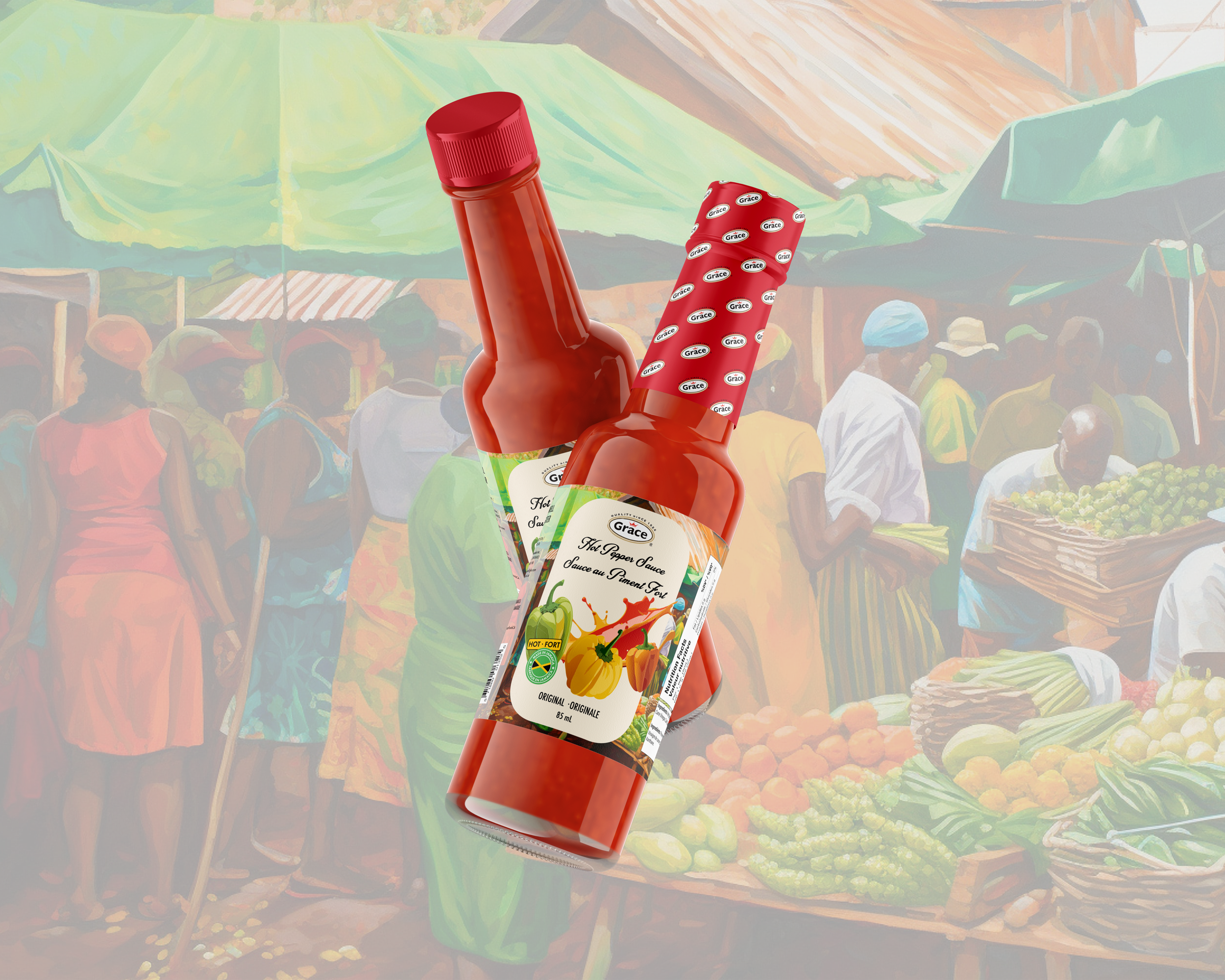
Grace: Label Redesign
Created for a packaging design course, this project focused on identifying a product within the food industry in need of a label refresh to improve shelf presence and consumer appeal. I selected Grace Pepper Sauce for its bold flavour and strong cultural identity, offering a great opportunity to elevate its visual impact while respecting its brand roots.
Design Intent
The goal was to redesign the label to better showcase the unique ingredients of each sauce variety and attract modern consumers within the demographic, without losing the authenticity of the original brand. Keeping the existing logo for brand recognition, I reconstructed the label layout and introduced vibrant, detailed imagery of key ingredients to create a more dynamic and appetizing presentation on the shelf.
The refreshed labels use bold, appetizing visuals of peppers and complimentary ingredients that communicate flavour profiles clearly and attractively.
Clean typography and improved text hierarchy ensure important information is easy to read, while the color palette aligns with the sauce’s heat level and flavour character.
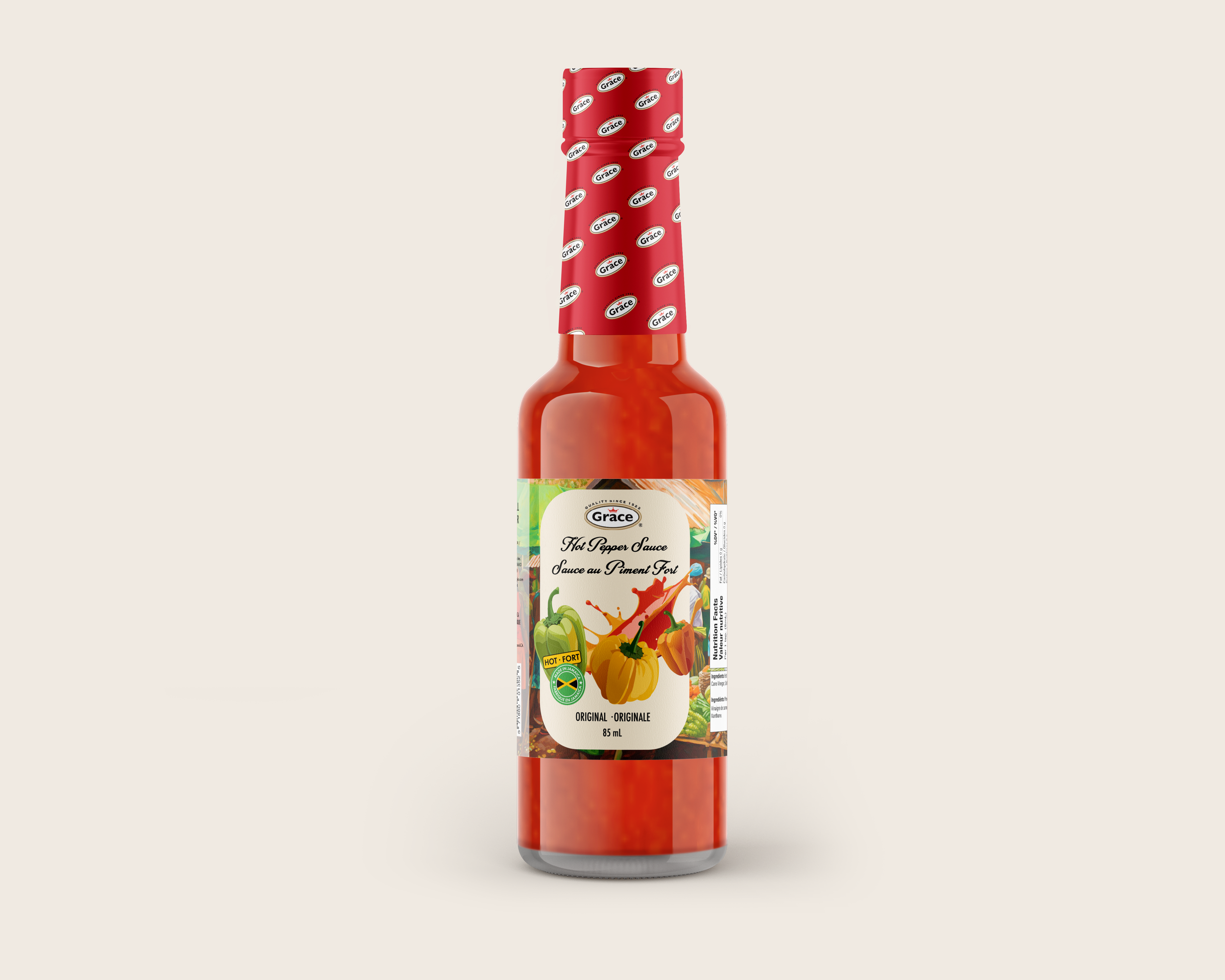
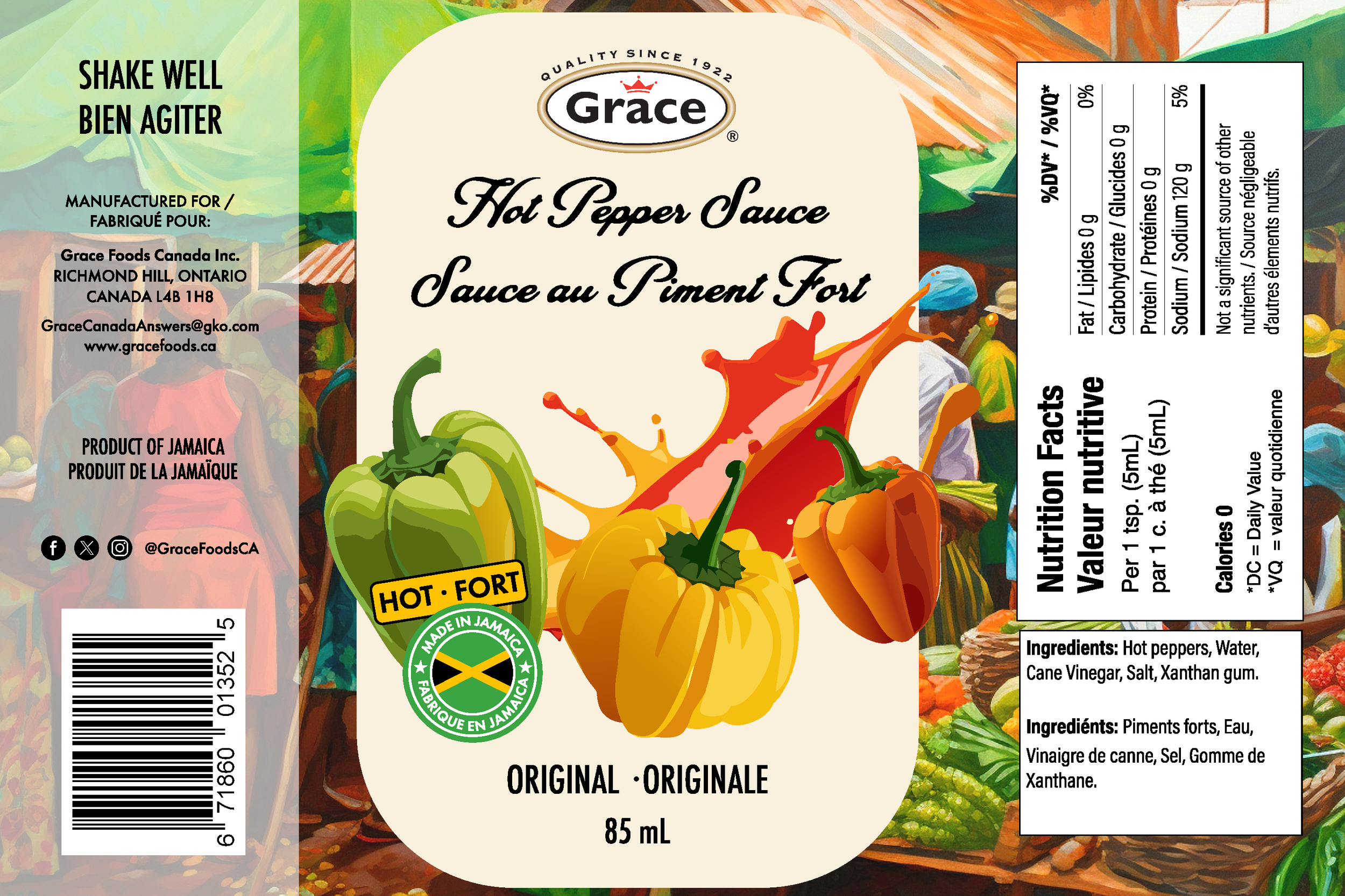
Original Hot Sauce Label Redesign
The redesign of the Original flavour focuses on bold simplicity—highlighting the sauce’s strong, classic heat with a cleaner layout and vivid imagery. The design balances tradition with a modern look, helping the product stand out while staying true to it’s roots.
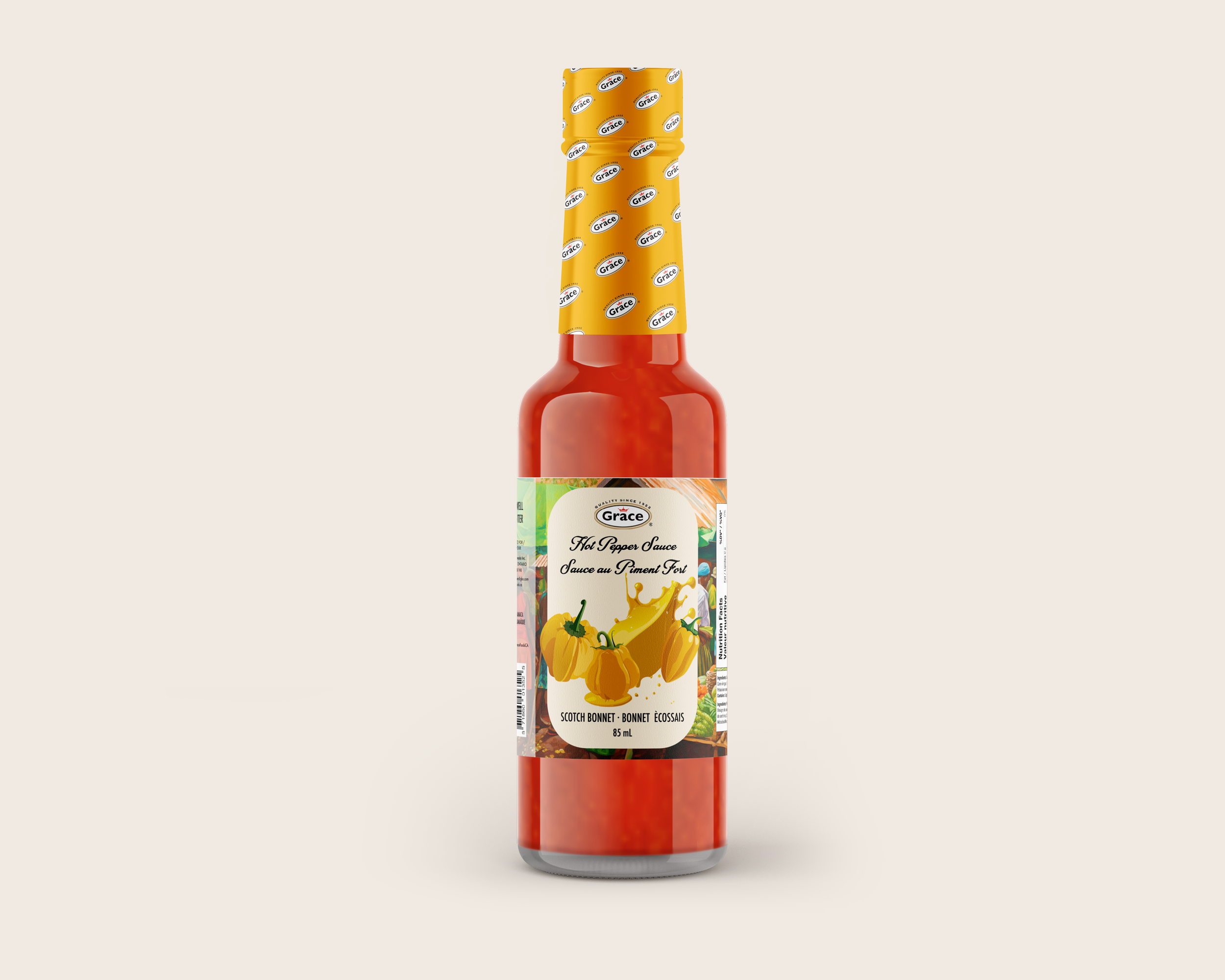
Yellow Scotch Bonnet Label Redesign
The label focuses on capturing bright, fiery personality of the Yellow Scotch Bonnet pepper. I used bold yellow hues and fresh ingredient visuals to emphasize its distinct flavour. The design brings energy to the shelf while maintaining cohesion with the rest of the line.
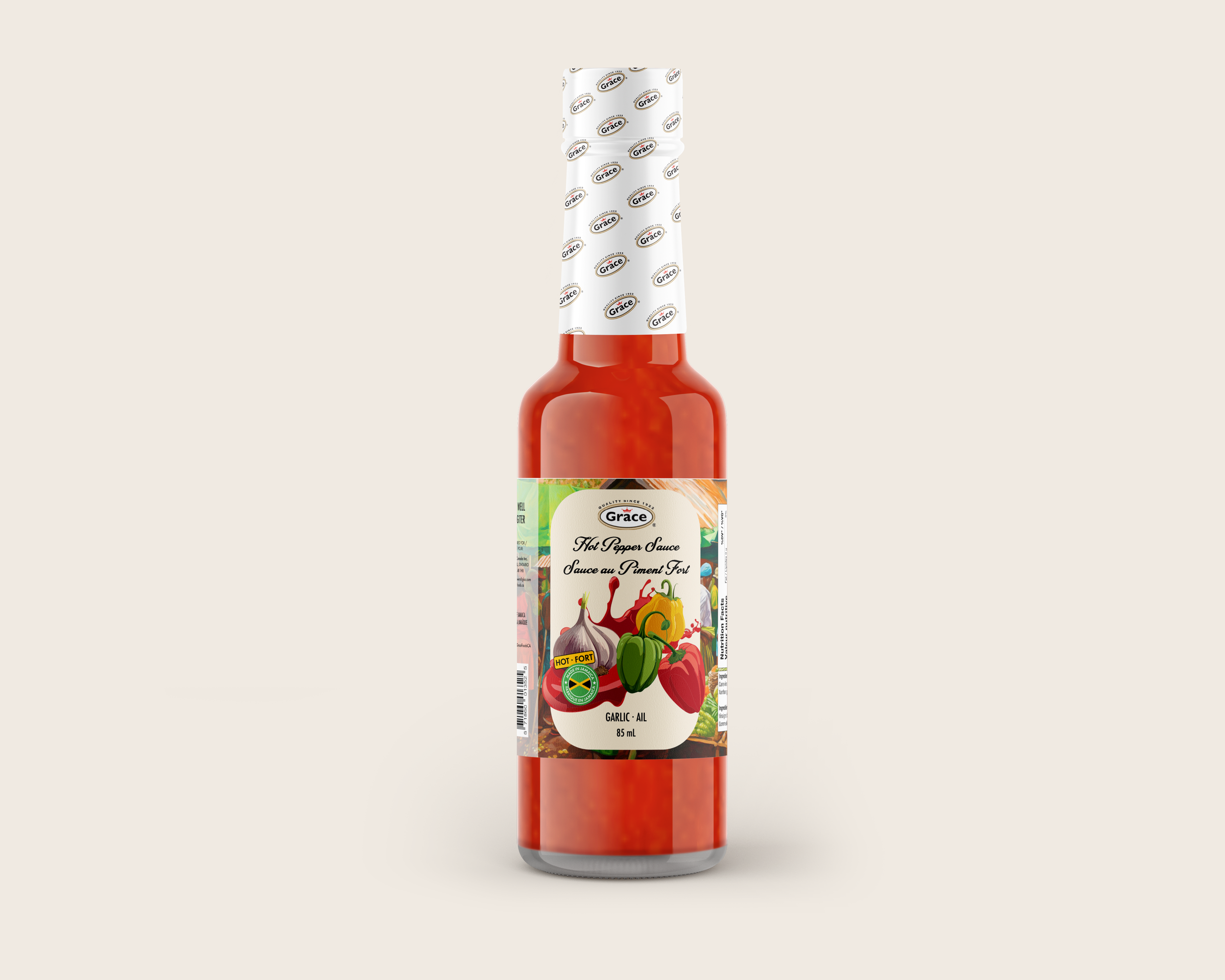
Garlic Sauce Label Redesign
The Garlic flavour redesign highlights the savoury aromatic notes of this variety. The layout stays consistent and clean with the rest of the line, while giving the garlic the spotlight it deserves.