Habibi Spa: Grand Opening
Habibi Spa’s rebrand marks a thoughtful evolution of a well-established wellness destination in the heart of Yorkville, Toronto. Rooted in over a decade of excellence, the refreshed identity balances familiarity with refinement, translating the spa’s values into a calm, elevated visual language.
The project included a comprehensive visual system redesign—spanning logo refinement, typography, and overall brand tone—crafted to evoke serenity, trust, and understated luxury. The result is a cohesive identity that resonates with long-standing clientele while positioning the brand to engage a new, design-conscious audience.


At the center of the new identity is an original illustration created to accurately represent Habibi Spa’s expanded location. Marking a significant milestone in the brand’s journey, the spa transitioned from a 400 sq. ft. space to a 2,000 sq. ft. destination—an evolution the illustration was designed to visibly capture.
Inspired by the ornamental forms and architectural details of Moroccan design, the mark symbolizes growth, craftsmanship, and a new chapter for the brand. More than a logo, it serves as a visual narrative of Habibi’s expansion while honoring the cultural roots that define its identity.
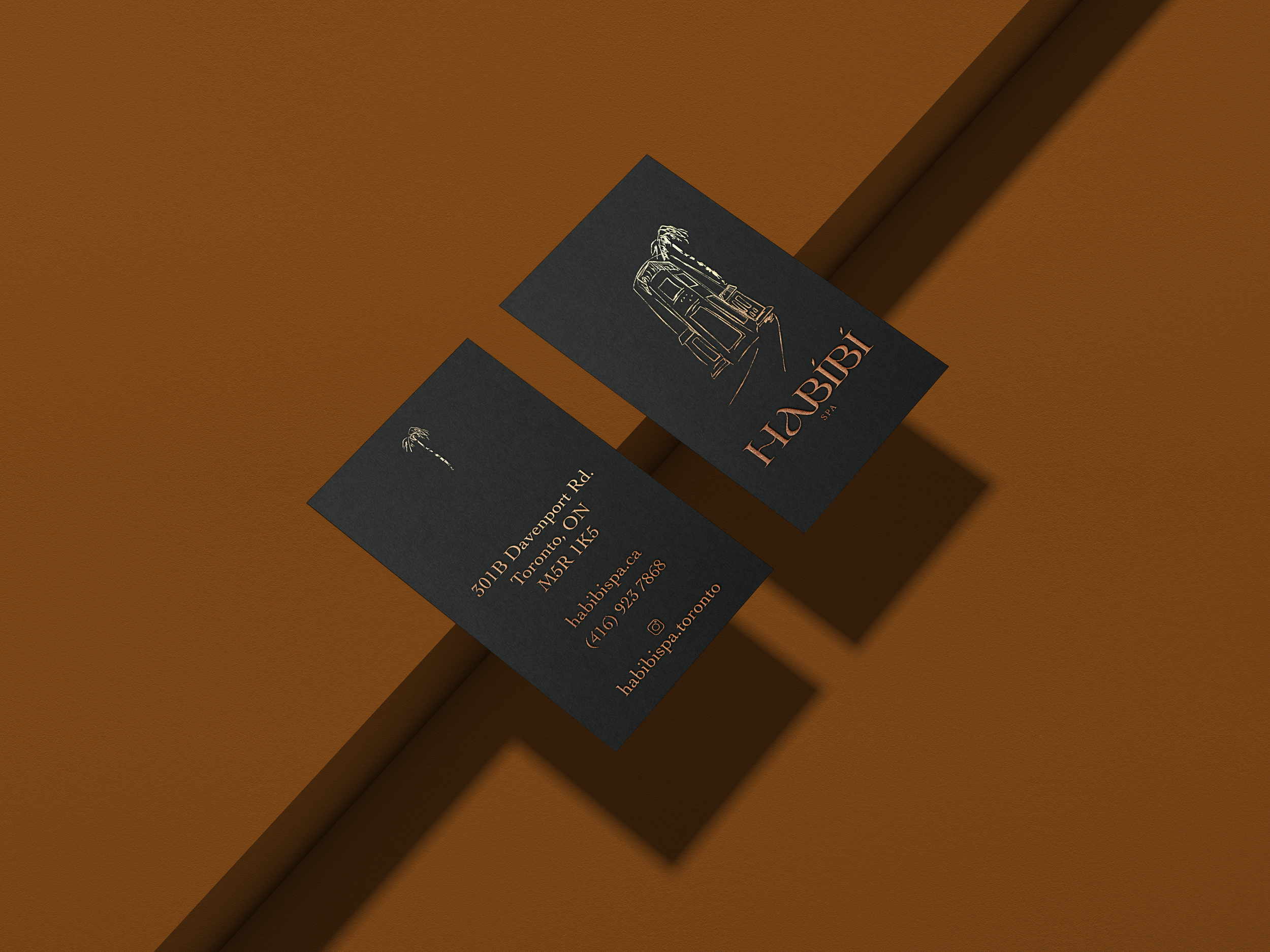
Business Card Design
Custom business cards were designed to reflect the brand identity refresh for Habibi Spa that reflect the brand’s modern, elevated aesthetic. Clean typography and minimal layout were paired with gold foil accents to add a touch of luxury and sophistication. The use of gold foil not only created visual impact but also reinforced the spa’s premium feel. These cards were crafted to leave a lasting impression while staying true to the brand’s refined and calming visual identity.
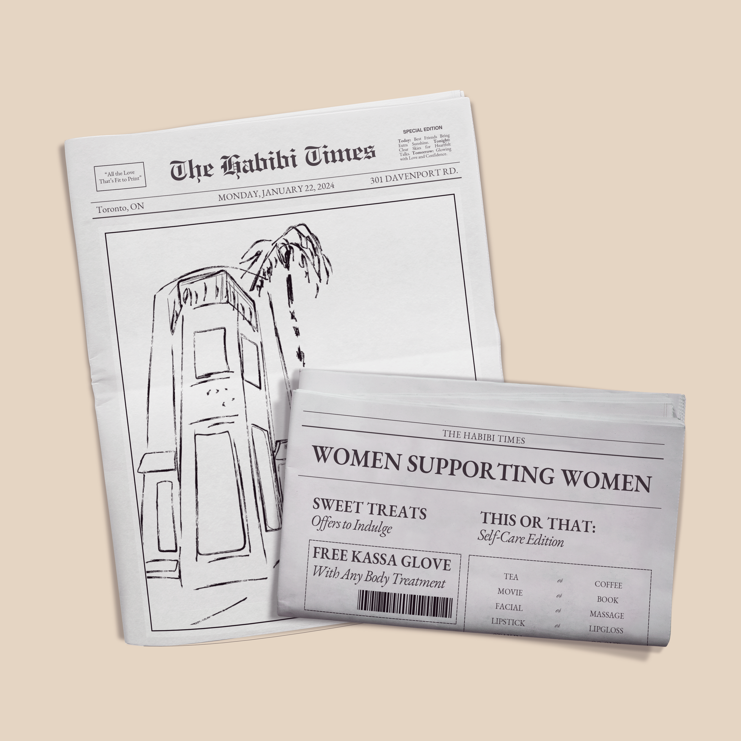

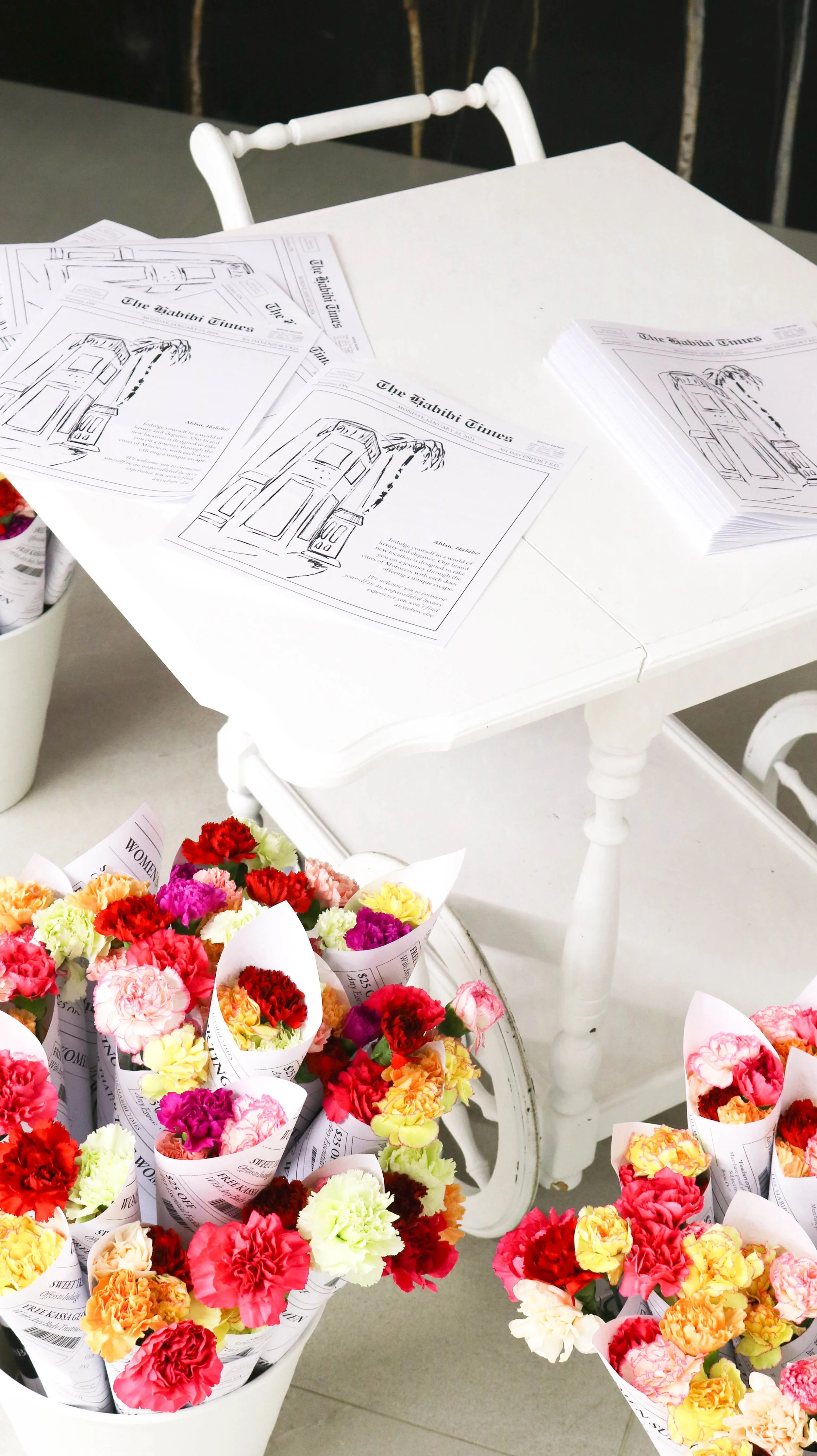
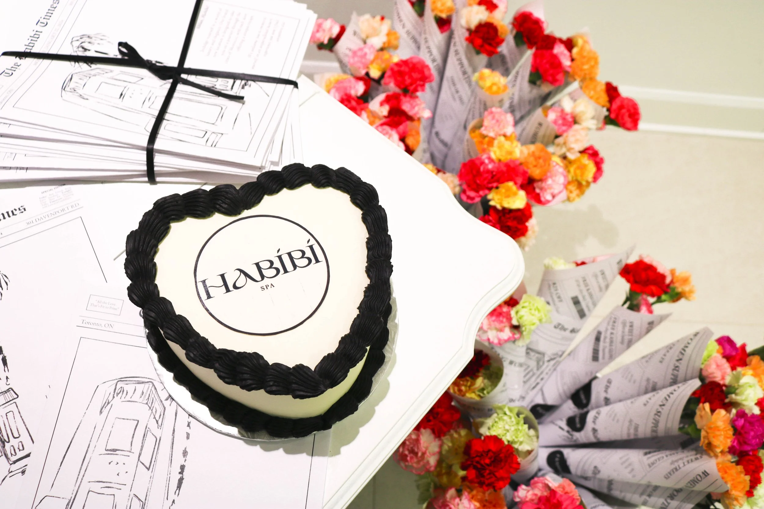
Custom Newspaper Design for Habibi Spa Opening
As part of the Habibi Spa reopening, I designed a custom newspaper to enhance guest experience and encouraged social media sharing. Playful and interactive, the newspaper featured a “this or that” game, a themed crossword, and exclusive promotional offers on the back. It doubled as a floral wrap at the event’s floral station—adding a personal, brand-aligned touch that attendees could take home. The goal was to merge function and fun while reinforcing the spa’s refreshed identity in an engaging, memorable way.
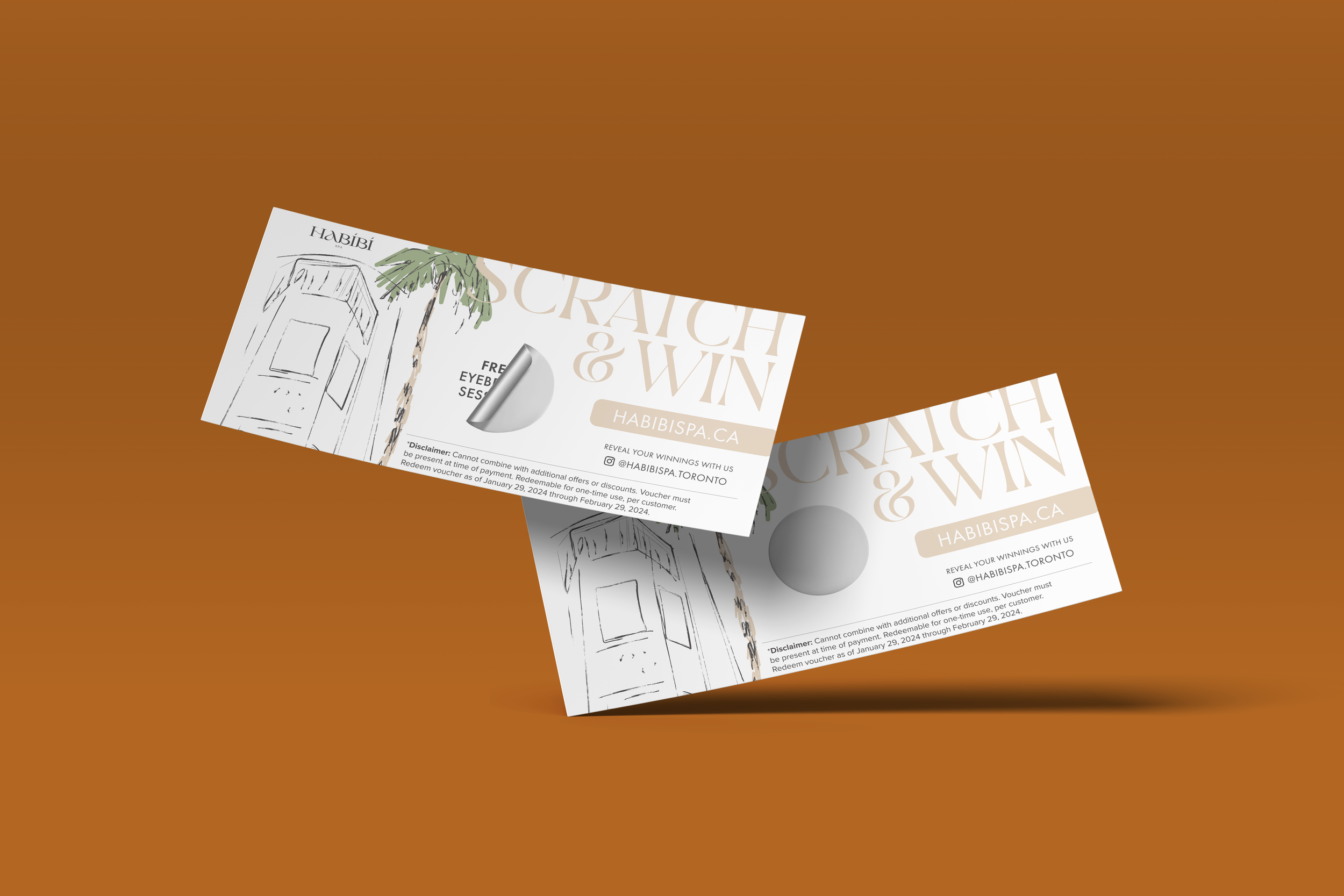
Scratch-Off Cards
As a part of the event marketing strategy for the reopening, I designed custom scratch-off cards to surprise and delight attendees. Each card offered a chance to win a unique service or promotional offer, creating an interactive moment that extended the brand experience. These cards served as both a playful incentive and subtle advertising tool—reinforcing the spa’s refreshed identity while encouraging future visits and social media engagement.
Branded Round Labels
Custom round labels were created to serve as cohesive branding elements across all event packaging—from food and florals to goodie bags and takeaway items. Designed to be versatile and visually consistent, these labels acted as elegant seals while reinforcing the new brand identity. Their minimal, thoughtful design added a polished touch to every detail, helping unify the overall event experience and extend the brand across all physical touchpoints.